How I turned an existing solution into a faster, cheaper way to improve trading activity in the US
tastyfx (formerly known as IG US) had a simple but costly problem – customers weren’t trading enough.
Three signals stood out:
- Engagement was low.
- Income per client was declining year over year.
- Positions were turning over slowly, with larger accounts often holding positions for multiple days.
There was also a competitive problem, as tastyfx had no clear unique selling proposition compared with the five major RFEDs.
That last part shaped my approach. Instead of starting from scratch, I looked for something we could reuse.
The goal:
Improve all 3 metrics rapidly.
A conventional research-and-design process would have meant significant time and cost.
Instead, I asked: “Does IG already have a solution that solves a similar problem somewhere else?”
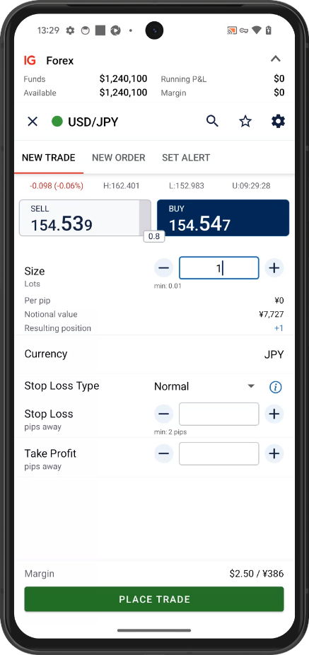
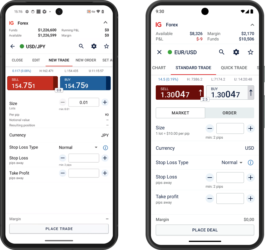
I reviewed IG’s products across other markets and found one. In Japan, IG had a trading interface called Quick Ticket, designed for experienced traders. It combined the essential functions of a dealing ticket with a view of open positions, allowing users to trade much faster.
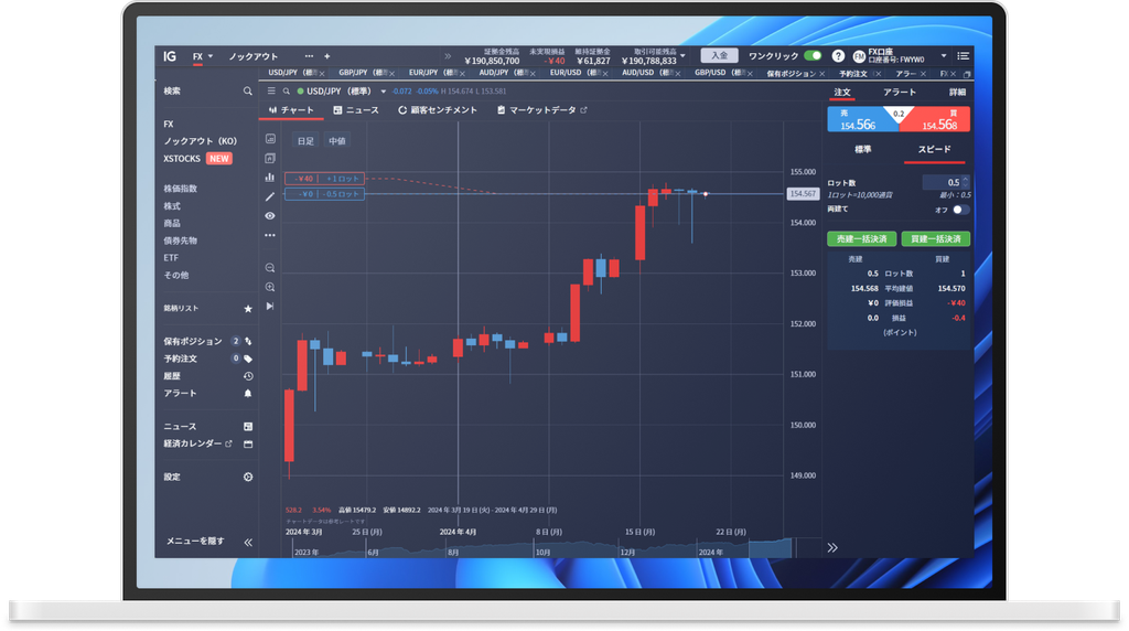
This changed the problem. We no longer needed to invent a new trading experience. We needed to determine whether an existing solution could work for US customers and adapt it intelligently.
Quick Ticket had two advantages:
- It had already demonstrated value. The Japanese solution had proven effective in terms of trading speed.
- We could reuse the existing code base. That made adaptation significantly cheaper and faster than developing an entirely new feature.
So rather than treating Japan’s solution as something to copy, I treated it as a starting point. The real design challenge became “what needs to change for Quick Ticket to make sense for US traders“?
Constraint #1: Speed had to be intentional.
Trading is heavily regulated. The proposed experience made trading significantly faster, which meant it was intended for experienced traders rather than everyone.
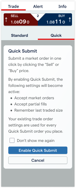
Compliance required users to consciously activate the faster trading mode, so the design couldn’t simply expose a faster interface by default.
Design decision:
Quick Ticket became an explicit trading mode, helping establish a clear distinction between the standard and accelerated experiences.
This wasn’t just a UI decision. It balanced two competing needs:
- user intent
- regulatory requirements
Constraint #2: Data told us what to prioritize.
Quick Ticket supported different order modes, but we didn’t want to carry over every capability just because it existed in Japan. I analyzed existing US trading behavior and found that most customers were using market orders only. That gave us a clear signal.
Design decision:
We deprioritized the limit-order mode and focused the experience around the behavior US customers actually used.
This kept the interface simpler while concentrating the investment where it could have the most impact.
Before
After
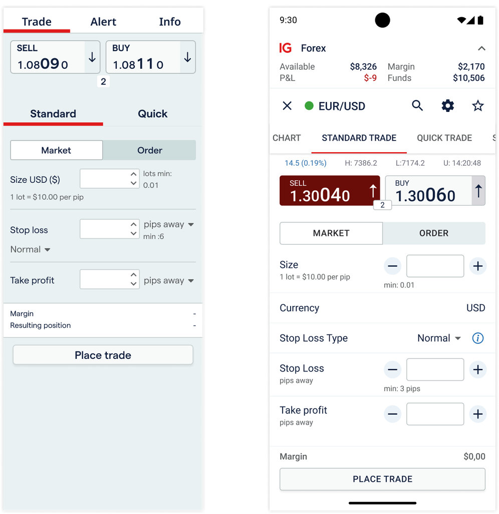
Constraint #3: One solution had to work across platforms.
The existing US experience differed between desktop and mobile. There was no full one-click dealing experience on desktop, and none on mobile. Quick Ticket gave us an opportunity to address more than trading speed.
Design decision:
As part of the integration, I unified navigation patterns across platforms.
This became an unexpected benefit of the project, as one trading model results a more consistent cross-platform experience.
Then the product changed underneath us.
While Quick Ticket was being developed, IG was also rolling out Price in Size (PiS) globally. PiS changes the spread depending on trade size. In a traditional deal ticket, this is relatively straightforward because the system knows the direction and size of the trade.
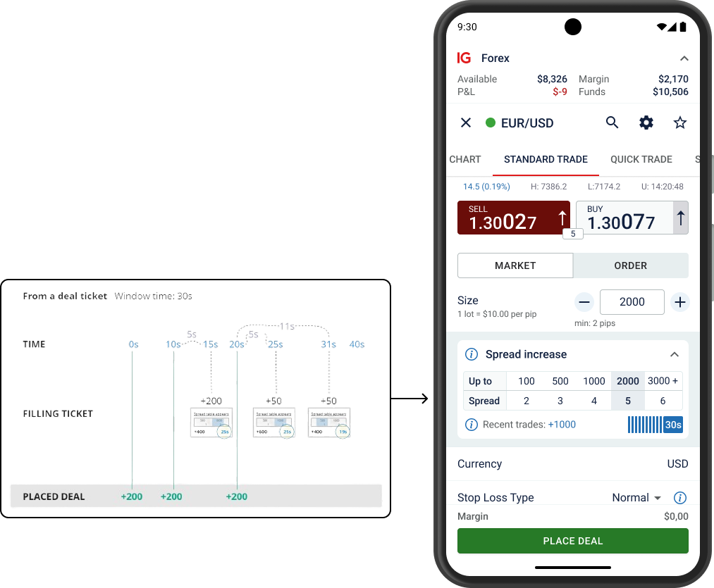
Quick Ticket was different. Users could go long or short with one click, or close all positions at once. That meant the interface potentially needed to communicate multiple prices and spreads simultaneously.
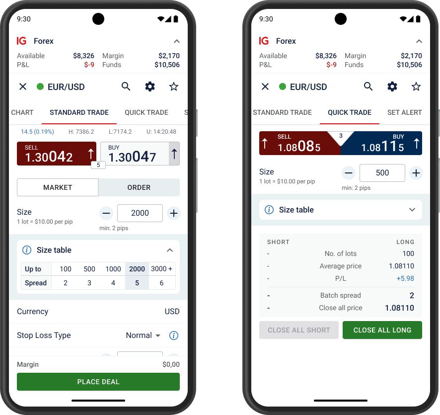
A feature designed to make trading faster could easily become more complicated. So I redesigned the information hierarchy.
Make the complexity available, not unavoidable.
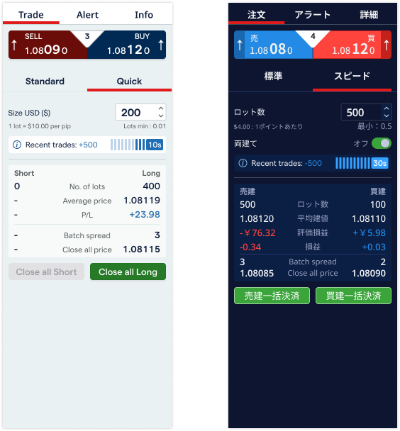
Instead of displaying every spread detail by default, I collapsed the spread table. Users saw only the information they needed most:
- Price
- Time until the normal spread
- Key information for closing positions
Additional batch spread and price information remained available for “Close all”, but it was moved out of the primary visual hierarchy.
I also kept the original Japanese deal buttons in the US experience. That small decision helped users visually distinguish Quick mode from Standard mode.
The principle:
Don’t hide complexity. Put it where users need it, and keep it out of the way when they don’t.
Standard trade with PiS
Quick trade with PiS
The result wasn’t just a faster ticket.
By reusing an existing solution, validating assumptions with US trading data, working within compliance constraints, and adapting the experience for PiS, we created a solution that could be launched faster and with less development investment… and the business case was significant.
Existing clients:
- +5% CIPC
- £0.75M annual revenue change
Quick Ticket was expected to encourage more activity and shorter holding periods, increasing revenue per existing client. It also reduced the number of clicks required for trading, particularly on mobile.
New clients:
- +10 first trades / month
- £0.17M annual revenue change
Quick Ticket gave tastyfx a differentiating feature – unique trading mode – for customers switching from competitors such as Oanda and Forex.com.
Combined opportunity:
- £0.92M annual revenue change
What I learned.
The biggest impact of this project wasn’t a new trading interface. It was finding a better way to solve the problem.
I didn’t start by asking: “What should we design?” I started by asking: “What already exists that we can leverage?”
That shift allowed me to:
- Turn an expensive greenfield problem into an adaptation problem.
- Use existing evidence instead of assuming all markets behave the same.
- Balance user needs with regulatory constraints.
- Reduce unnecessary complexity rather than simply adding functionality.
- Design for changes that were already coming to the product.
- Connect design decisions directly to business outcomes.
Good product design isn’t always about creating something new. Sometimes the strongest solution is recognizing what already works.
Bonus.
The design solution for implementing PiS in Quick Ticket was also rolled out to the Japanese market, creating a design cycle between Japan and the US: we initially adopted their solution, improved it, and then shared the enhanced version with them.