When optimizing the registration flow stopped being enough, I redesigned the architecture behind it
IG had been optimizing its account-opening experience for some time, but registrations had reached a plateau. We had reached the point where improving individual screens would deliver diminishing returns.
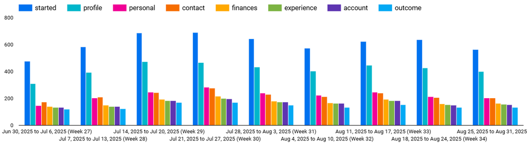
The reason was deeper: the architecture of account opening itself was creating friction.
The goal:
Significantly increase both registrations and activations.
So instead of asking how to make the existing flow slightly better, I asked: “What if registration didn’t have to be tied to opening a financial product?”
The hidden constraint.
The existing process actually combined two different jobs:
- Create a user profile.
- Add a financial product.
But users were forced to complete both at the same time. This created a structural problem. The business decides what information is needed to create a profile. The regulator decides what information is required to provide leveraged trading services.
Those requirements had become bundled into one registration experience. A user who simply wanted to start a relationship with IG was immediately pushed into a product-specific process.
The existing flow had four fundamental problems.
The current process took around 8–9 minutes and was largely the same for everyone. But time wasn’t the only issue:
- Too much commitment too early.
Users had to provide sensitive information and make decisions before they had fully committed to becoming a customer. - We lost people who didn’t finish.
If someone abandoned during profile creation, they were effectively lost. If they abandoned later during product addition, we could only reach them by email. - The model couldn’t scale.
The US currently had one product, but future product expansion would make the registration flow increasingly complicated. - Corporate customers didn’t fit.
Corporate applications required different regulatory information and were still handled on paper.
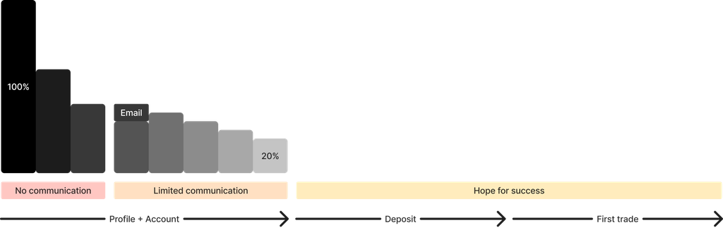
The architecture was optimized for one product, one customer type, and one journey. That wasn’t going to scale.
I looked at the questions, not just the screens.
I reviewed the entire registration experience and looked for points where users were being asked to do something that wasn’t actually necessary to create their profile.
Four friction points stood out:
- Username: finding an available username created unnecessary frustration.
- Password: the combination of minimum/maximum length and character requirements added friction.
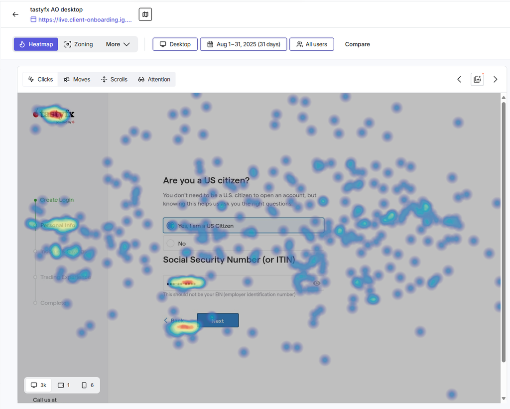
- SSN: US users were particularly hesitant when asked to provide this highly sensitive information.
- Product selection: research from markets with multiple products showed that choosing a product could become a significant drop-off point.
One signal was especially strong: when users reached the SSN question, many exited the flow or tried to go back. This suggested that the problem wasn’t simply form length. We were asking for too much commitment too early.
The architectural change.
I proposed separating account opening into two distinct stages:
Stage 1
Create a relationship with IG.
Stage 2
Choose and open a financial product.
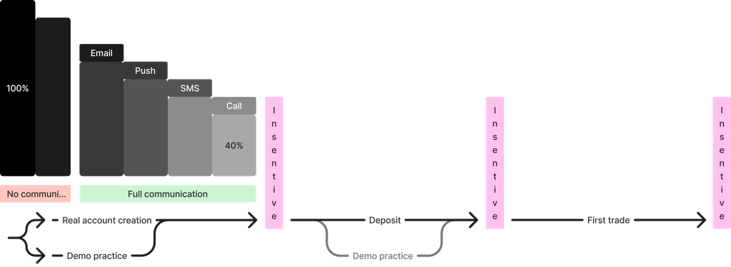
This separation would exist both technically and from the user’s perspective. The important shift was in user’s ability to become an IG customer before deciding which product they wanted.
That made registration product-agnostic. And suddenly, several previously disconnected problems became easier to solve.
Stage 1: remove the product commitment.
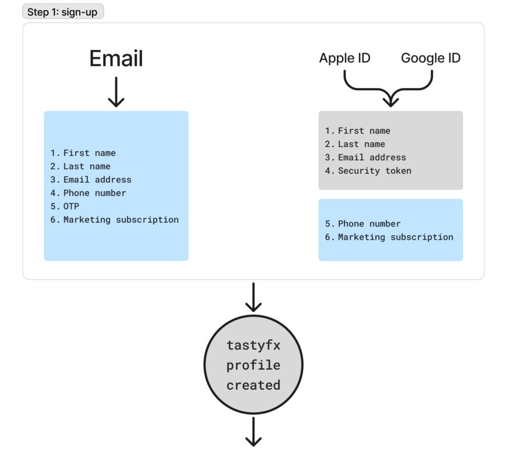
The first step would no longer require users to provide an SSN or select an account type. Instead, they could create a profile with much less friction.
This also created an interesting opportunity: “What if we let them enter through a demo account?”
A quick login could let users experience IG before committing to a real trading product.
It also gave us a potential way to test two hypotheses:
- Could we identify potential Prime customers earlier?
- Does committing to a deposit amount increase the likelihood of completing registration later?
The key point wasn’t to add more questions. It was to use the newly created relationship with the user to learn before asking for a larger commitment.
Then I removed registration mechanics that didn’t create value. Once the architecture was separated, several pieces of friction became unnecessary:
- Remove the username.
Users don’t need to invent and remember a username if we can identify them another way. - Automate password creation.
Instead of making users manually satisfy password rules, we can remove another decision from the process. - Support Apple and Google IDs.
Users already trust these identity providers. - Verify phone numbers with one-time passwords.
This also gives IG a verified communication channel for potential customers.
The pattern was consistent: every removed field was one less decision between the user and becoming an IG customer.
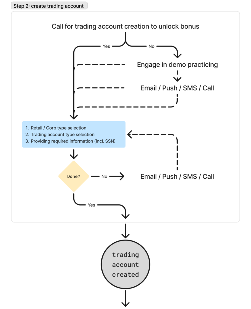
Stage 2: Ask for product information when it becomes relevant.
Once a profile exists, product-specific requirements can move into the second stage. This is where the SSN and product selection belong. The difference is subtle but important.
Previously: “Give us everything required to open this product.”
Now: “Create your relationship with us first. We’ll collect what’s required when you choose a product.”
This also gives the business something it didn’t have before – a known potential customer who can be contacted and guided toward activation.
Product selection becomes an activation problem.
Separating registration from product selection also changed how I thought about drop-off. If someone isn’t ready to choose a product, we don’t necessarily need to lose them. Instead, we can experiment with ways to help them continue.
Hypotheses to test:
- Time-limited demo: allow users to use a demo account for a defined period without immediately opening a trading account.
- Multiple accounts: if product requirements are sufficiently similar, allow customers to create multiple account types at once.
- Activation incentives: offer a temporary benefit for completing product creation (for example, an increase in interest on unused funds).
The important distinction:
Registration success and product activation become two separate problems that can be optimized independently.
New architecture also opens the door to more customers.
The new model isn’t only about reducing friction for the existing US flow. It creates a foundation for future expansion:
- New products no longer need to be inserted into the initial registration journey.
- Corporate customers can eventually follow an appropriate profile and product path rather than relying on a separate paper process.
- Apple, Google, phone verification and demo access can all become ways into the same underlying customer relationship.
The registration layer becomes product-agnostic by design.
I treated the solution as a system, not a single feature.
Prioritization was based on both business (the need to launch new products as soon as possible) and the technical needs (“weight” of each feature). The work progressed through several connected pieces.
Done:
- User + competitor analysis
- Prototype
- Decompose the concept into individual features
- Support multiple products
Backlog:
- Add phone verification
- Remove username
- Add one-time password support
- Add Apple & Google registration
- Enable registration without a product
The result was not one redesigned registration screen. It was a new model for how users enter the IG ecosystem.
There was another reason to rethink the account-opening architecture. After IG Group split its teams across locations, different teams became responsible for different parts of a shared codebase. This created two problems for our region:
- We had limited control over changes needed for our market.
- Updates made by teams in other introduced instability into our part of the product.
Taking full ownership of the codebase at some point in the future was a strategic direction, but doing it all at once would have been expensive.
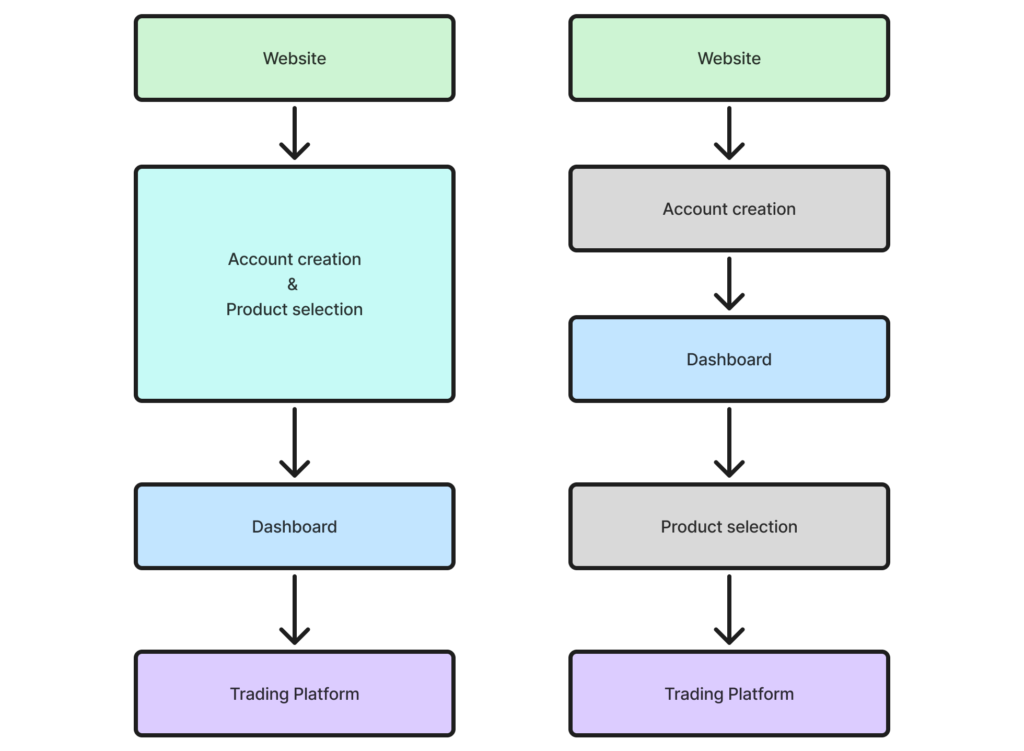
I proposed account opening as the first candidate toward that transition. The new architecture could be decomposed into several independent parts, allowing us to gradually replace and decommission the shared legacy services we depended on rather than attempting a costly migration in one go.
This meant the project had a second, longer-term benefit. We weren’t only creating a more flexible registration experience. We were creating a path toward reducing our dependency on shared Group services.
The product architecture therefore became a bridge between two goals: improving the customer journey today and reducing technical constraints for the region over time.
Old structure of services shared by 4 teams
New structure with 2 services owned by us
What changed in my thinking.
The biggest lesson from this project was that conversion problems aren’t always interface problems.
When a funnel plateaus, the natural response is to optimize copy, particular fields, layout, etc. But sometimes the real problem is the relationship between the steps. In this case, profile creation and product creation had been bundled together even though they served different purposes. Separating them changed the problem completely.
The takeaway.
Don’t optimize a constrained system forever. When the existing architecture becomes the bottleneck, improving the interface can only take you so far.
The more fundamental solution was to change the sequence from one giant step:
Create profile + choose product + satisfy product requirements
To step-by-step process:
Create profile → explore → choose product → activate
That creates a more flexible registration system for users and for the business. The design opportunity wasn’t to make registration faster, it was to make registration independent of the product decision.