How I challenged a professional-first trading experience and used research to design a simpler path for beginners
IG had built its trading experience around sophisticated customers. That made sense for its existing client base, but it also created a problem for growth – new customers weren’t making their first trade.
The goal:
Expand beyond professional traders and attract people with investment experience but limited trading experience.
So the challenge became: “How might we remove the barriers to making a first trade without compromising the experience of existing professional traders?”
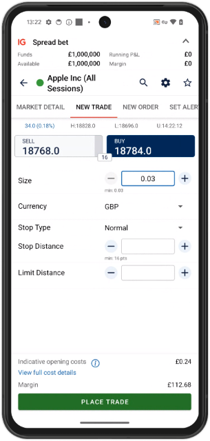
Beginners were entering a professional tool.
IG already invested heavily in education through IG Academy, IG TV and Demo Accounts. But after all that preparation, a beginner still arrived at essentially the same professional trading interface.
The deal ticket assumed users already understood concepts such as:
- Deal size
- Margin
- Distance
- Stop and limit levels
- Pricing conventions
For an experienced trader, these were familiar controls. For a beginner, they created questions before the first trade could even happen. The product was powerful. But power was becoming a barrier to entry.
I challenged the initial direction.
I joined after the first round of user interviews. The existing approach was focused on simplifying the professional solution: essentially giving novice users the same functionality with easier terminology.
I questioned the premise: “If the business wanted to attract a fundamentally different customer, should we really be optimizing the professional interface?”
I proposed a different direction. Design a genuinely simpler experience for beginners with investment experience, rather than giving beginners a simplified version of the professional tool.
This was not purely a UX decision. It implied changes to support, fees and potentially brand perception. Stakeholders were nevertheless interested in pursuing the opportunity.
Previous research
My research proposal
First principle: don’t simplify everything. Remove what beginners don’t need.
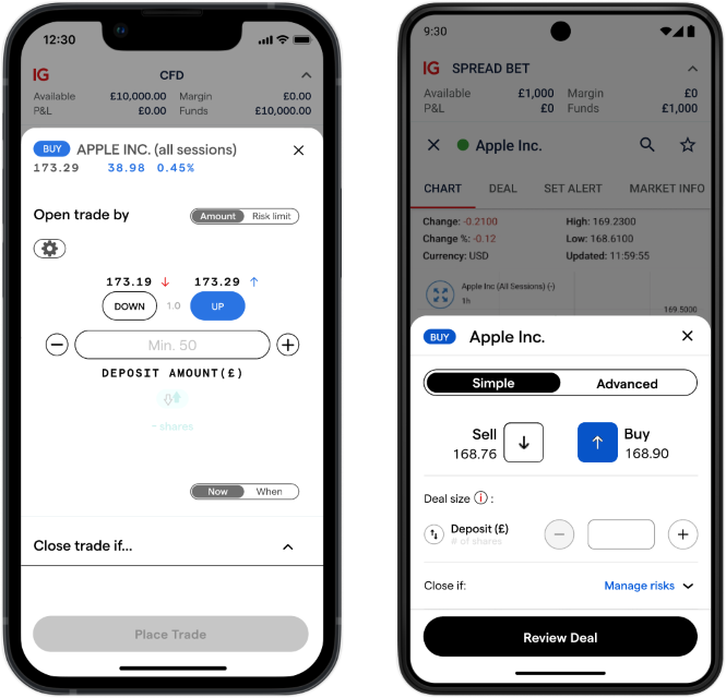
The initial prototype tried to preserve much of the professional functionality. After analyzing the first research results and existing trade statistics, I proposed a more radical approach.
Instead of asking: “How can we make every feature easier to understand?”
I asked: “Which features do beginners actually need to make their first trade?”
That led to a much smaller core experience.
Removed from the beginner flow:
- Intraday market information
- Spread
- Market order mode
The result wasn’t a professional interface with simpler labels. It was a different product experience built around the first trade.
But I didn’t want to break the existing product.
There was an important business constraint: IG already had professional customers who knew and relied on the existing experience.
So I proposed a strict separation:
Simple mode:
A reduced experience designed to lower the barrier to the first trade.
Advanced mode:
The existing professional deal ticket, unchanged.
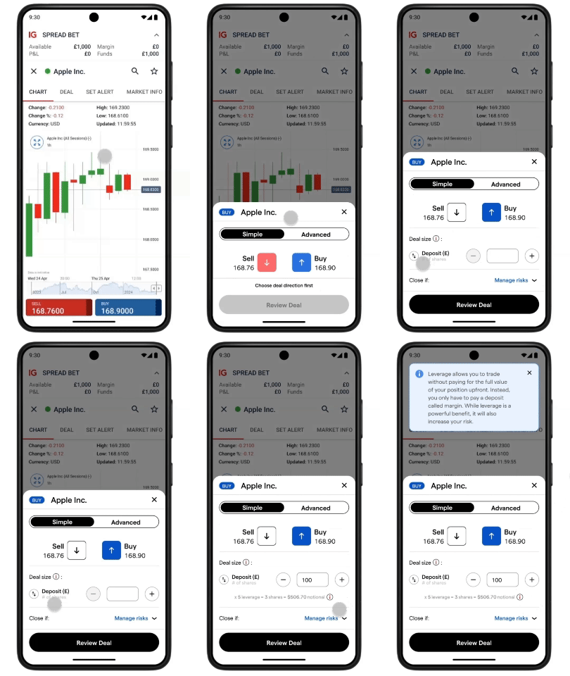
This reduced implementation scope while protecting the experience of existing customers. It also gave the business a safer way to experiment. We could change the experience for a new audience without forcing the existing audience to change with it.
Then research became a hypothesis engine.
Rather than treating user interviews as a final validation step, I used the findings to decide what to test next. Several important questions emerged.
How should users define trade size? Research showed that users struggled with concepts such as “pounds per point”. However, we didn’t have enough evidence to remove alternative sizing completely. So I kept both: “Deposit value” and “Number of shares”.
This allowed us to test whether the new mental model was easier without prematurely removing an existing option.
What about leverage?
Another pattern was clearer. First-time customers frequently struggled to understand leverage.
Instead of filling the interface with explanations, I proposed progressive disclosure: short explanation by default, more detail when requested.
The principle was simple: explain the concept at the moment it matters, without turning the deal ticket into a textbook.
One surprising finding changed the flow.
Data showed that 95% of users opened the deal ticket without having a predetermined direction.
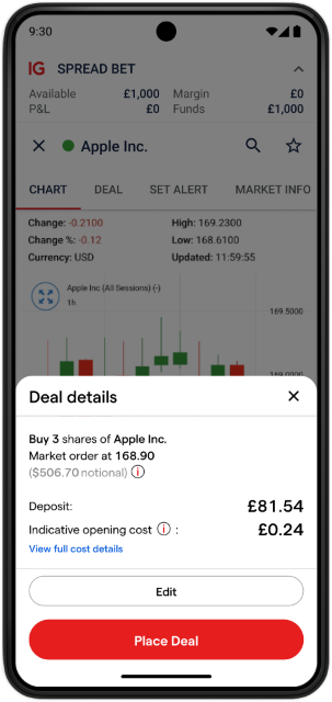
That raised an important question: “If users weren’t sure whether they wanted to buy or sell when they opened the ticket, should the interface give them a chance to review the trade before committing?”
For professionals, an extra confirmation step could feel unnecessary. For beginners, it could provide reassurance. So instead of deciding based on personal preference, I turned the tension into a hypothesis: “Could an additional review step increase confidence for beginners without creating unacceptable friction?”
Not every idea survived.
I also explored a stronger approach to risk management. My hypothesis was that for beginners, simplicity should mean safety, not speed. I experimented with automatic loss limitation.
But the idea wasn’t approved by technical and compliance stakeholders. Since IG does not provide advisory services, customers are ultimately responsible for making those decisions themselves.
So we deliberately avoided adding more manual risk-management controls. The final experience retained only the deposit-value-based option.
This was an important design outcome too. Good product design isn’t just knowing what to add. It’s knowing when evidence, technology or regulation tells you to stop.
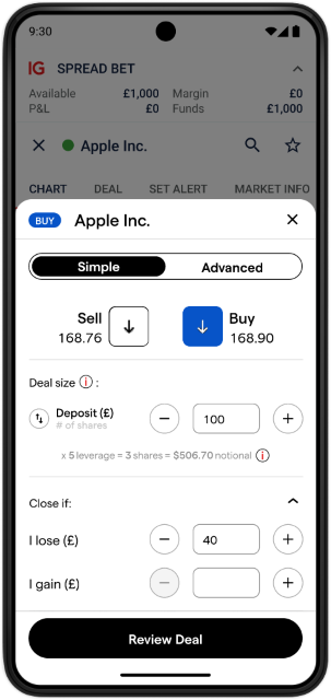
We designed the research to answer specific questions.
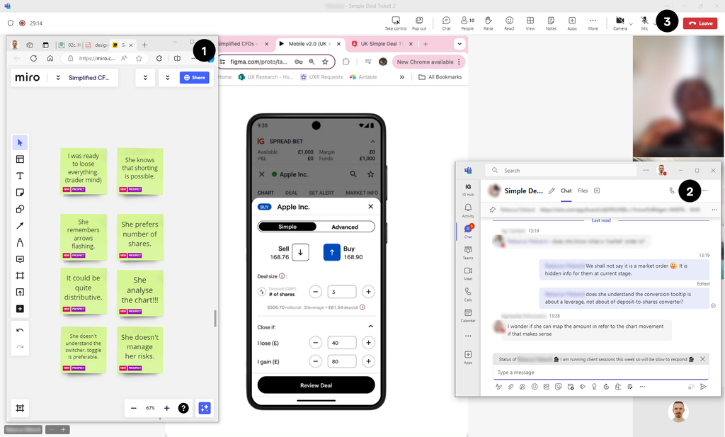
For the second round of interviews, we didn’t simply show users the new design and ask whether they liked it. We entered with explicit hypotheses.
The team used:
- A Miro board to capture observations and thoughts during interviews.
- A private stakeholder chat to discuss questions in real time.
- A clickable prototype shared with participants through Teams.
As interviews progressed, we gathered evidence to support or refute each hypothesis. This turned research into an iterative decision-making tool rather than a presentation at the end of the design process.
The second iteration showed positive results.
The research supported the direction of the simplified experience, leading to a third iteration. At that point, however, structural changes inside the company moved the work from a centralized team to local offices. The project subsequently took different paths in the UK and Japan.
So this case doesn’t end with a polished launch metric, and that’s important to acknowledge.
The value of the project was in the decision-making process:
- We started with a professional-first product.
- We challenged whether that model could support the company’s growth ambition.
- We used research and behavioral data to reduce the experience to a smaller set of essential decisions.
- We protected existing customers through a separate advanced mode.
- And we turned uncertainty into testable hypotheses rather than assumptions.
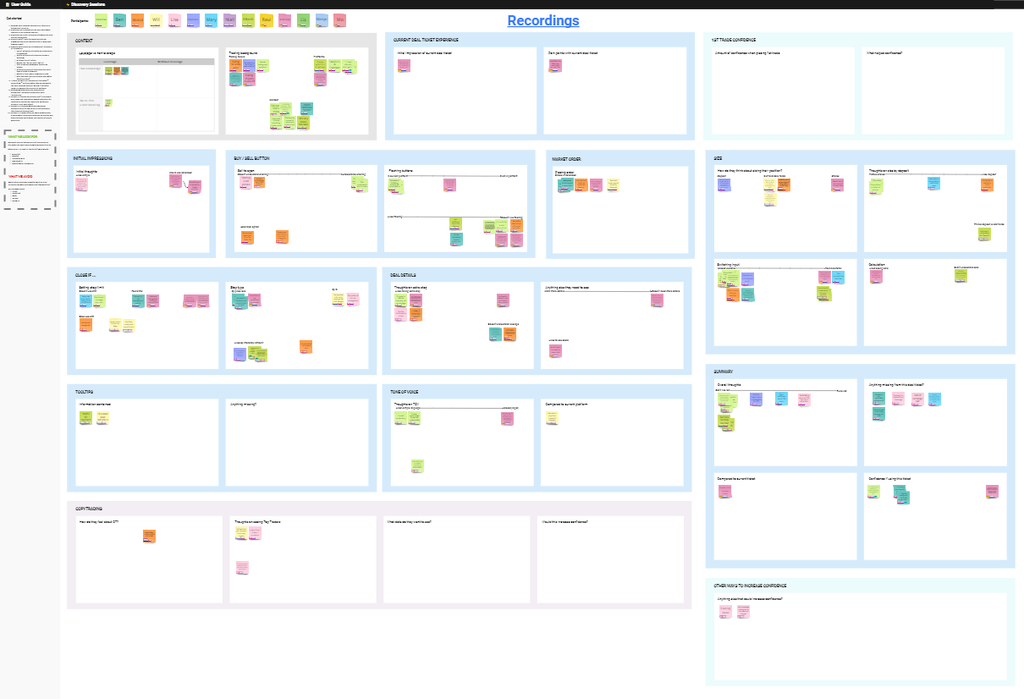
What this project says about my approach?
I challenge the problem before designing the solution. The initial question was essentially “How do we simplify the professional ticket?” I reframed it as: “Should beginners be using the professional ticket at all?”
I used evidence to decide what to remove. Simplification wasn’t about rewriting labels. It was about reducing functionality based on actual behavior.
I designed within business constraints. The solution had to work alongside an existing professional experience, a rebranding initiative, technical limitations and compliance requirements.
I treated research as an input to decisions. Each research round generated new hypotheses and informed the next iteration.
I am comfortable stopping. Not every idea needs to ship. Sometimes the strongest design decision is recognizing that an attractive idea doesn’t survive technical, regulatory or business constraints.
The core lesson of this project:
Don’t make a professional tool easier for beginners. Build only what beginners need and let professionals keep the tool they already know.
Taking the research into a live product.
Once I moved to the US team, I was looking for an opportunity to implement a new trading ticket for forex traders. Unfortunately, the product backlog was overloaded with other priorities. Then, during one of the sprints, an Android developer finished his sprint task earlier than expected. I used that unexpected capacity to push for a test of the new trading ticket.
The time available wasn’t enough to implement every idea I had explored, but it was enough to test several of the changes.
I defined two business-related KPIs:
- Higher total and average margin on opened positions submitted.
- Higher rate of successfully submitted deals.
Alongside these, I defined two UX-related KPIs:
- Fewer total “Insufficient funds” banners shown.
- Faster trade submission.
From research findings to testable changes.
I analyzed the existing trading ticket through the lens of what we had learned from previous research.
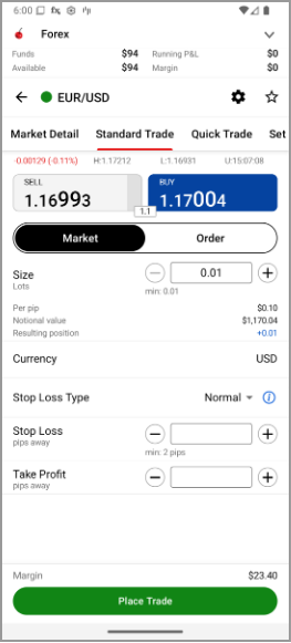
Several elements stood out (version A):
- Maximum lot size was unknown. Users had to calculate how much they could trade themselves.
- SL/TP settings were always visible, despite being used by only around 10% of users.
- Margin was displayed at the bottom of the screen, far away from the size controls, even though it was close to the trading CTA.
- Notional value was visible, despite being mostly unused.
- “Resulting position” was duplicated between the size field and the trade information on the same screen.
I changed these elements (version B):
- Maximum lot size became available directly in the ticket, removing the need for users to calculate it.
- SL/TP values were hidden by default to reduce informational noise.
- Margin calculation was exposed in the middle of the screen, allowing users to see the relationship between trade size in lots and the required margin in one place.
- Notional value was removed.
- “Margin available” was duplicated, allowing users to quickly assess the ratio between the size of a single trade and their available funds.
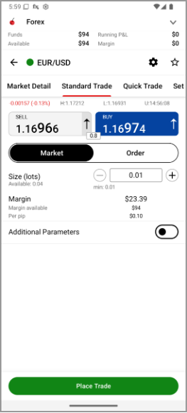
The test was conducted with Android users only – the least popular platform among US customers. Visitors were automatically split between the two variants: A=385 users vs B=413 users.
Test results.
Hypothesis 1: The new trading ticket will increase total and average margin.
The results looked very promising at first, with an apparent +338% improvement. However, the result did not reach statistical significance. The hypothesis was not proved. The actual result turned out to be neither better nor worse than the existing experience.

Hypothesis 2: The new trading ticket will increase the rate of successfully submitted deals.
We saw a +7% improvement in the new version. Again, however, the result did not reach statistical significance. The hypothesis was not proved. The actual result turned out to be neither better nor worse than the existing experience.

Hypothesis 3: The new trading ticket will reduce the number of “Insufficient funds” banners shown.
Interestingly, the new version performed worse, with +28% more banners shown. But the result did not reach statistical significance. The hypothesis was not proved. The actual result turned out to be neither better nor worse than the existing experience.

Hypothesis 4: The new trading ticket will make trade submission faster.
This was the clearest result. We observed a 54% reduction in time spent submitting a trade, with high statistical significance. This hypothesis was proved.

What actually changed?
The strongest validated outcome wasn’t a financial KPI. It was a UX outcome: users could execute trades substantially faster. The changes were focused on two principles:
- More contextual awareness.
- Less friction.
The test also started an important internal discussion about the limits of our influence on financial performance.
If we can make a trading experience substantially faster and easier, how much should we expect that to influence financial outcomes?
We started asking harder questions:
- Was the number of users simply too small to detect an effect?
- Are external factors vastly more influential on financial performance?
- Would testing the same experience among desktop and iOS users produce the same results?
The experiment didn’t answer all of these questions. But it did something equally valuable: it gave us evidence about where the new experience did have an effect, where it didn’t, and what we needed to investigate next.